I want to create a series of blogposts about brand logos and their meaning. The first one will be an introduction to brand logos: Chanel & Lacoste. In my Masters’s Thesis, I analyzed a few logos and I enjoyed them very much, so I thought why not continue?
Some of our favorite bands are easily recognizable through their logo, but have you ever asked yourself for what the crocodile in Lacoste stands or why the Chanel logo consists of two C’s?
Today I will bring you the answers and some interesting facts about famous brands.
Chanel
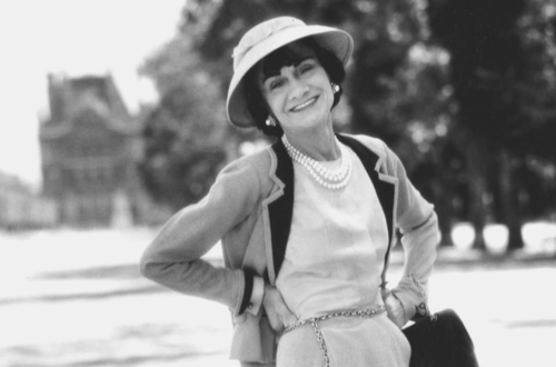
Designed in 1925 by Coco Chanel, the logo has not been changed ever since. Today it is one of the most recognizable brand symbols in the world. The two ‘C’ – one facing forward and the other facing backward, are the symbol of elegance and eternal style.

Chanel chose the two C’s because she was allegedly inspired by her visit to the Château de Crémat in Nice, France, Others claim that the logo was inspired by the convents and church floors of the Abbey of Aubazine, where she grew up as a little girl. In case you did not know it yet, you can find the Chanel logo on every lamp post in Westminster in London, as Chanel was in love with the Duke of Westminster – and even though she never became a Duchess – he paid homage to Chanel, by putting her logo on every lamp post in Westminster. So the next time you walk by a lamp post with her logo, remember the Queen of Paris.
Lacoste
Founded in 1933 by the tennis player René Lacoste and André Gillier the brand created Polo shirts that could be worn while playing tennis.

The sports gear back then was really heavy and thus not really made for sports. René Lacoste created the famous polo shirt with a collar that can be put up, in order to protect the neck from the sun. Furthermore, the Polo shirts were longer, thus they could be tucked into the pants and they would stay tucked, even when the player was running around.
The crocodile simply symbolizes, René Lacoste, as he was called the crocodile after “eating up” his competitors.


